Moyo Village
Industry: Travel
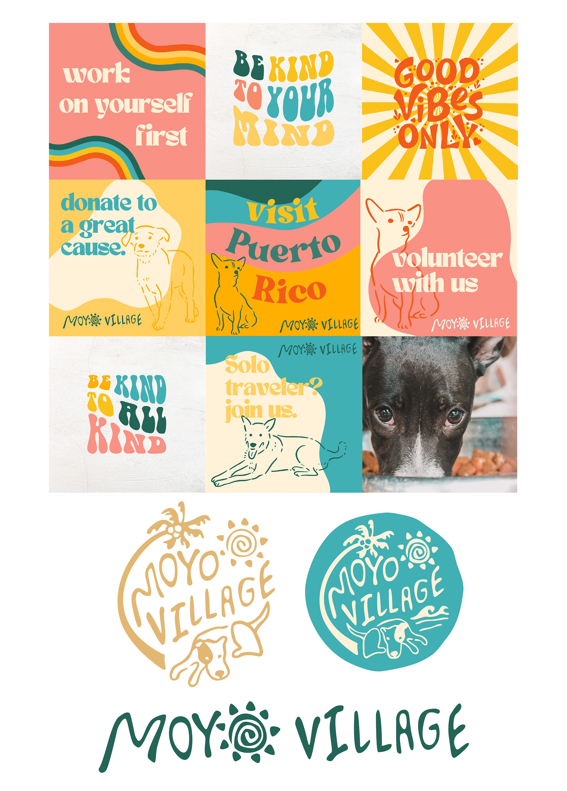
Designing the brand identity for Moyo Village, an organization focused on immersive travel experiences in Puerto Rico that combine environmental exploration with volunteering at local animal shelters, was an exciting and meaningful endeavor.
The key challenge was to capture the essence of Puerto Rico’s vibrant culture, the beauty of its natural landscapes, and the heartfelt connection between travelers and animals. The logo, featuring a joyful dog running on the beach, embodies the spirit of the experience offered by Moyo Village—taking adoptable dogs to the shore for a refreshing swim and a break from confinement. The colors selected for the brand are a harmonious blend of Puerto Rico’s lively cultural palette and the serene hues found in places like El Yunque National Forest.
Industry: Travel
Designing the brand identity for Moyo Village, an organization focused on immersive travel experiences in Puerto Rico that combine environmental exploration with volunteering at local animal shelters, was an exciting and meaningful endeavor.
The key challenge was to capture the essence of Puerto Rico’s vibrant culture, the beauty of its natural landscapes, and the heartfelt connection between travelers and animals. The logo, featuring a joyful dog running on the beach, embodies the spirit of the experience offered by Moyo Village—taking adoptable dogs to the shore for a refreshing swim and a break from confinement. The colors selected for the brand are a harmonious blend of Puerto Rico’s lively cultural palette and the serene hues found in places like El Yunque National Forest.
The brand, with its lively logo and carefully curated color scheme, speaks directly to the adventurous souls seeking purposeful travel experiences in Puerto Rico.
REVIVAL Cocktail Co.
Industry: Food / Beverage
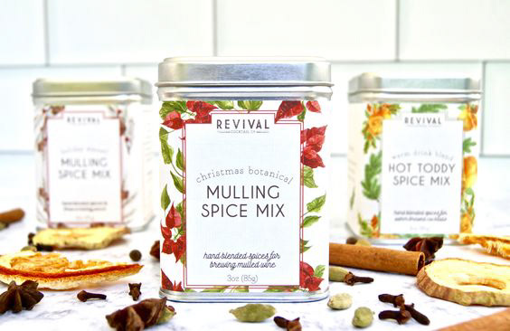
I Worked with Revival Cocktail Co., a South Carolina-based cocktail mixer company dedicated to elevating cocktail crafting with all-natural ingredients. I choose a branding that struck a balance between simplicity and sophistication. This versatile design seamlessly translates across online platforms and merchandise, creating a cohesive brand experience.
The packaging design, features minimalist visuals and hand-drawn illustrations of the spices and herbs used in the mixer kits, enhancing the overall product experience and shelf presence.
Industry: Food / Beverage
I Worked with Revival Cocktail Co., a South Carolina-based cocktail mixer company dedicated to elevating cocktail crafting with all-natural ingredients. I choose a branding that struck a balance between simplicity and sophistication. This versatile design seamlessly translates across online platforms and merchandise, creating a cohesive brand experience.
The packaging design, features minimalist visuals and hand-drawn illustrations of the spices and herbs used in the mixer kits, enhancing the overall product experience and shelf presence.
DevsCenter
Industry: Technology
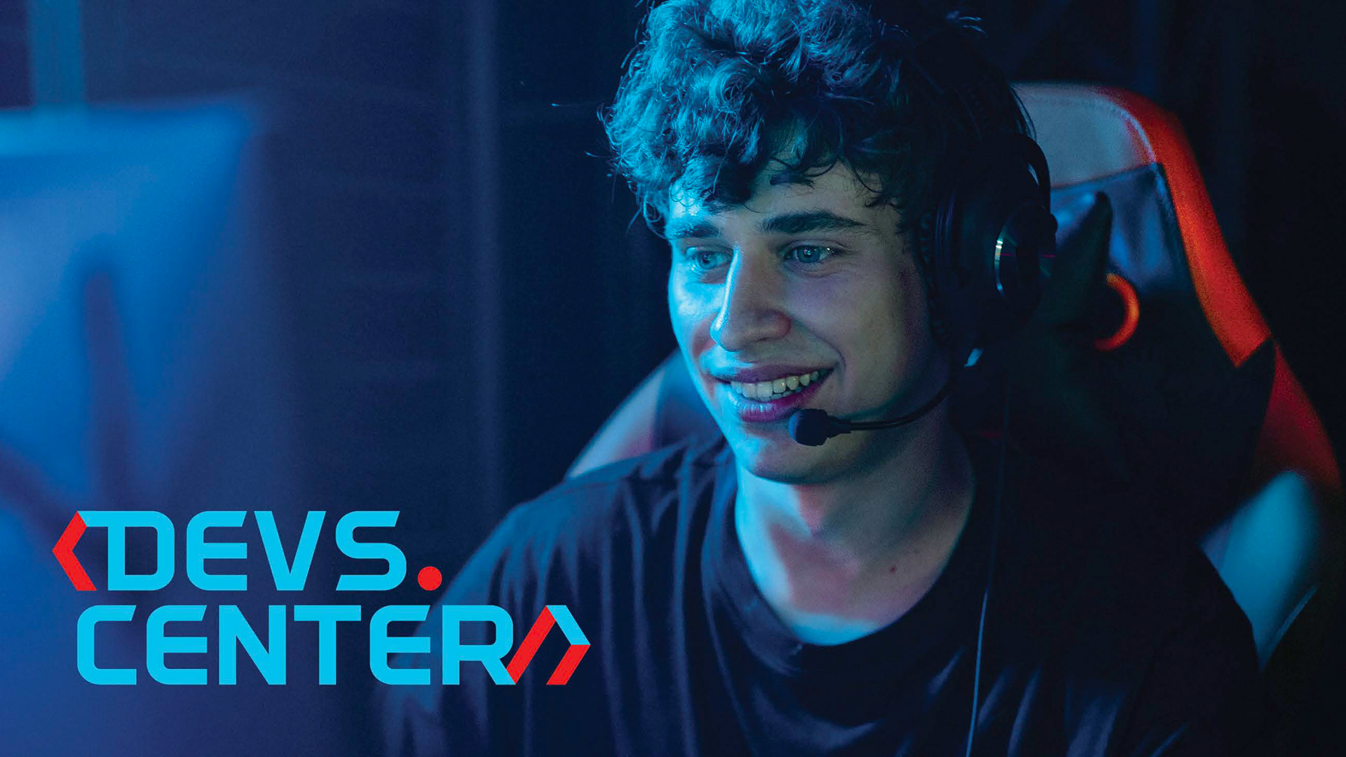
Crafting the brand identity for DevsCenter was a dynamic journey that aimed to encapsulate the essence of a global online community for developers. Embracing the cutting-edge nature of technology, I chose a predominantly dark color scheme with strategic pops of dynamic blue and energetic red in a 3D effect. This not only reflects the advanced tech focus but also adds a sense of vibrancy to the overall aesthetic. The chosen modern and legible typefaces ensure that information is easily accessible, resonating with the community's commitment to learning and sharing knowledge.
Industry: Technology
Crafting the brand identity for DevsCenter was a dynamic journey that aimed to encapsulate the essence of a global online community for developers. Embracing the cutting-edge nature of technology, I chose a predominantly dark color scheme with strategic pops of dynamic blue and energetic red in a 3D effect. This not only reflects the advanced tech focus but also adds a sense of vibrancy to the overall aesthetic. The chosen modern and legible typefaces ensure that information is easily accessible, resonating with the community's commitment to learning and sharing knowledge.
The website, designed as part of the branding, serves as the gateway to an expansive world of collaboration. It directs members to join the dynamic conversation on Discord and Slack, where developers from around the world come together to learn, share advice, and collectively evolve. The brand voice exudes a sense of innovation, inviting members to be influencers and leaders, emphasizing the values of knowledge-sharing, continuous learning, and career growth.
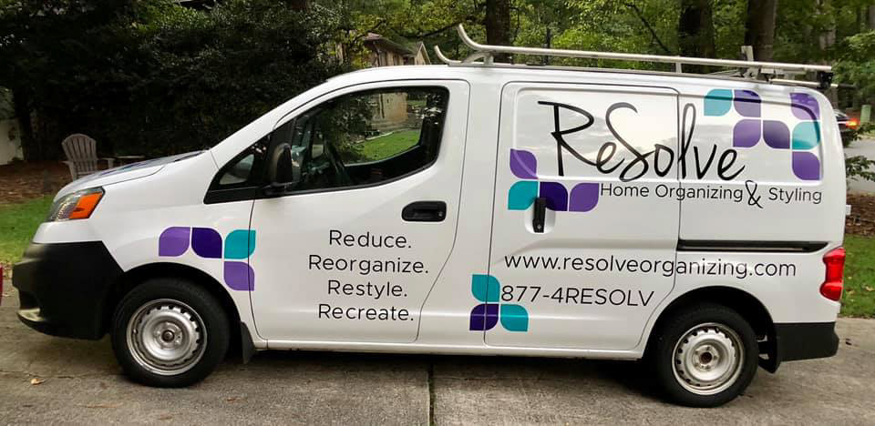
ReSolve
Industry: Cleaning, Organizing, and Styling
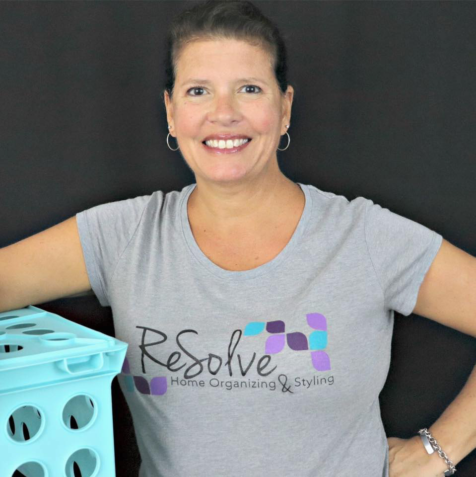
Collaborating with ReSolve, a cleaning, organizing and styling business, I spearheaded the creation of a comprehensive brand identity from scratch. Owner Kim Benson’s desire to incorporate her handwritten signature led to a distinctive and personal touch, while organized shapes symbolized the business’s efficiency. This unique blend became the foundation for the logo and branding materials.
Industry: Cleaning, Organizing, and Styling
Collaborating with ReSolve, a cleaning, organizing and styling business, I spearheaded the creation of a comprehensive brand identity from scratch. Owner Kim Benson’s desire to incorporate her handwritten signature led to a distinctive and personal touch, while organized shapes symbolized the business’s efficiency. This unique blend became the foundation for the logo and branding materials.
The cohesive brand extended seamlessly across various platforms, from a dynamic van cover that served as a mobile billboard to an engaging online presence and a user-friendly website. Each design element, including Kim’s handwriting and organized shapes, was thoughtfully applied to maintain consistency. Employee T-shirts, doubling as uniforms and branding tools, reinforced team unity and the brand’s identity. This condensed and unified approach resulted in a memorable and impactful brand for ReSolve, reflecting its commitment to excellence in the cleaning and organizing industry.